26 Nov
Doing a good job makes clients happy.
And communicating with them – also providing information that is not always sales related – shows you care.
So, here’s a list of seven common mistakes virtually everyone makes when it comes to labels for chemicals.
Going through them will help you make better labels and build trust with clients.
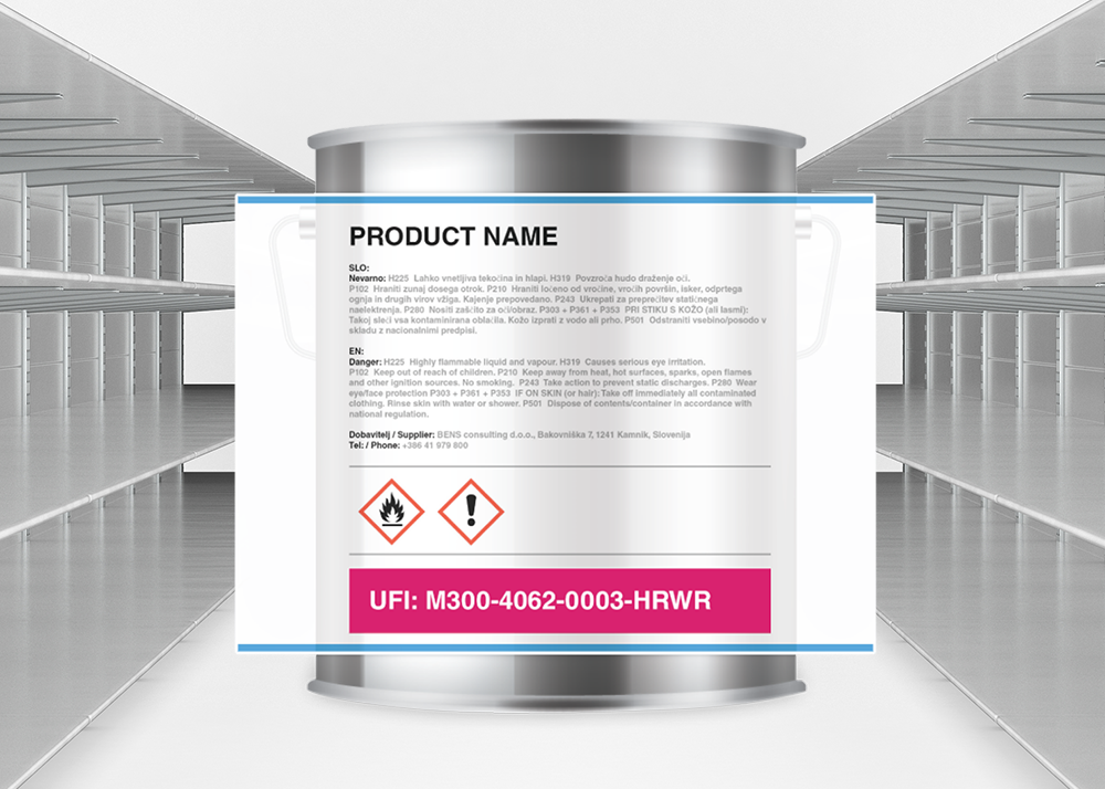
Mistake one. Labels used solely as a marketing tool while neglecting the obligatory legislation content.
It’s fine to put marketing material on label. Just remember that you also need to include the necessary legal information such as hazard statements. For that you need to look into the Safety Data Sheet for that product.
Including both pieces of information is making consumer aware of potential dangers (not just benefits) before using that product.
Mistake two. Using different names on the label and the safety data sheet for the same product.
We understand that sales and marketing is also about words and their appeal. And product name is certainly something that companies spend a lot of time thinking about. But this is thinking in terms of sales.
You need to be careful here. If you decide to make a product more appealing and therefore changing the name, then you need to do the same with the corresponding Safety Data Sheet.
Mistake three. Black and white GHS hazard pictograms instead of coloured ones.
The logic here is that black and white doesn’t stand out as much as coloured pictograms do.
While that might be the case, it’s sales thinking which will get you into trouble again.
You need to use only pictograms – including coloured ones – that are officially approved.
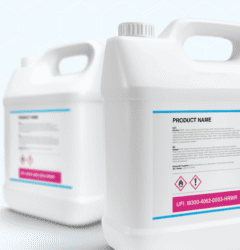
Mistake four. Label where the text is too small to read.
What do you do when you have limited space and don’t want to delete any of the text you wrote?
If you’re anything like me and most people, then you first try with smaller fonts. The same is true when it comes to labels for chemicals.
There’s nothing wrong with using smaller fonts, if they pass the reading test.
Labels shall be firmly affixed to one or more surfaces of the packaging immediately containing the substance or mixture and shall be readable horizontally when the package is set down normally.
So, if you and most of your colleagues can read the label when it’s 20 to 30 cm away from you, then the font size is OK. In our experience, font size 6 or more is large enough.
Mistake five. The size of GHS hazard pictograms matters.
The second most common solution, when it comes to finding additional space on labels, is related to shrinking the size of GHS hazard pictograms.
“As long as they are there, we should be OK”, goes the thinking. Not true. The smallest allowed pictograms for packaging up to 3 litres must measure at least 10 x 10 mm.
You need to be sure you’re using the right pictogram dimensions for your packaging.
Mistake six. Horizontally orientated text on a vertically positioned product.
Your clients should be able to read the label on the shelf without turning their heads for 90 degrees.
This is not just me talking it is what CLP legislation demands of you. Here’s what it says:
“Labels shall be firmly affixed to one or more surfaces of the packaging immediately containing the substance or mixture and shall be readable horizontally when the package is set down normally.”
Mistake seven. Names of dangerous substances are not translated in local languages.
These might sound as over-reacting, but we’ve seen products being moved from shelves just because of this one tiny detail.
You need to be sure that names of substances are translated in your local language. It’s not enough to use international or English names.
Now that you’ve gone through the list, the logical question is …
How many of these mistakes do you make?
Consultant for ADR and Chemicals Disclaimer: Information on this blog is prepared with utmost care, but it is not about (chemical) consulting, and the provider does not assume any responsibility or liability for the correctness, accuracy and up-to-dateness of published content. If you need advice for a specific case, you can write to us.

Simona Miklavčič