23 Apr
At the end of 2024, a major revision of Regulation (EC) No 1272/2008 on the classification, labelling, and packaging of chemicals (CLP Regulation Revision) was published. The new chemical labelling rules will come into force on 1 January 2027, but you can already start applying them now in Chemius.
Among other things, the CLP Regulation Revision introduces new rules regarding chemical labelling. We are all eagerly awaiting the guidelines that will more clearly define these new rules. They are expected before summer. Until then, we’ve prepared some practical instructions to help you start preparing new labels.
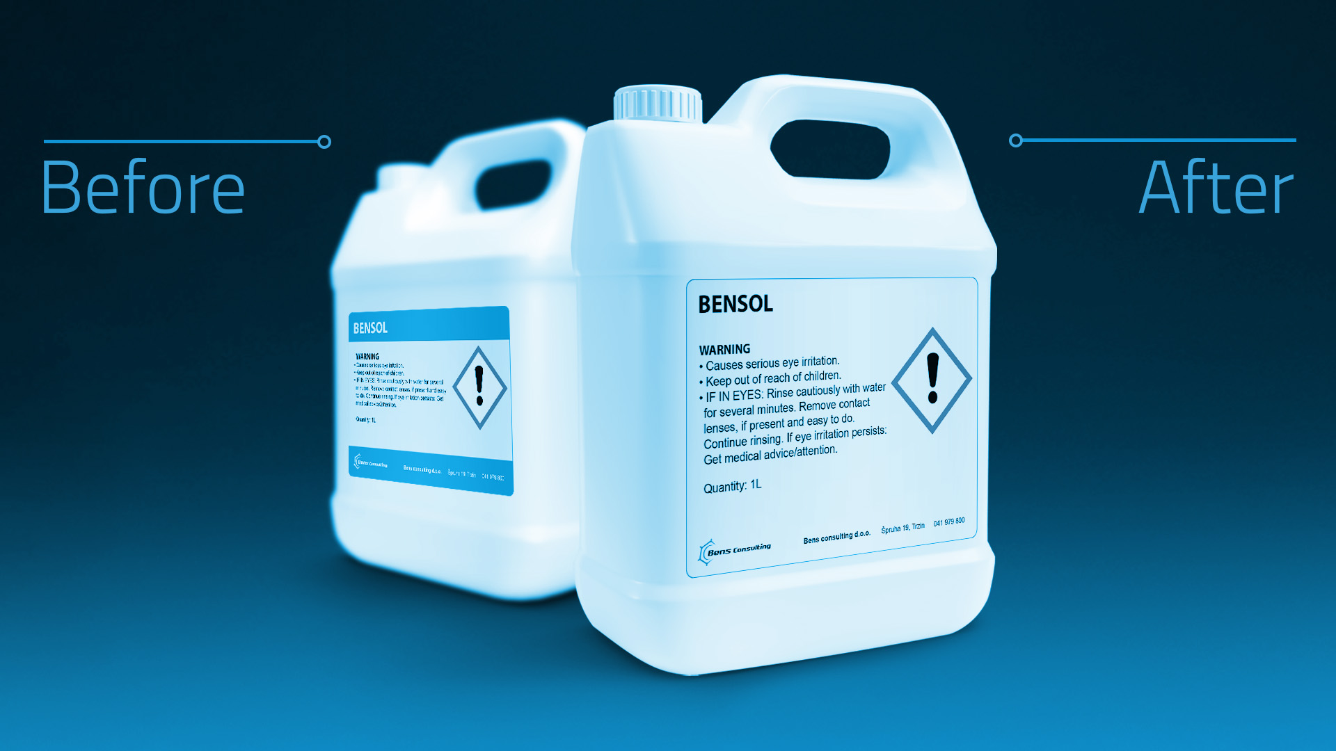
In the past, it was important for a label to be legible or readable. The label size and the size of CLP pictograms were defined, but the font size was not regulated. From now on, however, the minimum font size (specifically, the height of the lowercase “x”) is also prescribed.
All of these parameters now depend on the volume of the packaging, as shown in the table:
In addition to the minimum font size, the following four text features on the label are now also defined:

1. The text must be printed in black on a white background

2. Line spacing must be at least 120% of the font size.
This is the rule that causes the most confusion in practice. What does line spacing mean exactly? We’ve prepared two possible interpretations:

Line spacing interpretation 1:
The size of the lowercase “x” is defined (e.g., 1.2 mm). This “x-height” is used as the basis for calculating line spacing. In this case, line spacing = 120% of the x-height. So, if 1.2 mm is 100%, then 120% equals 1.44 mm.

Line spacing interpretation 2:
The size of the lowercase “x” is defined (e.g., 1.2 mm), but the line spacing is calculated from the total font size “Y”. In this case, line spacing = 120% of the font size Y.
These are just two possible interpretations of the line spacing requirement. The official guidelines should clarify this further.

In plain terms: you need to ensure there is enough empty space between the lowest part of a letter in the top line (like “y”) and the highest part of a letter in the line below it (like “X”).
3. Only one font type may be used, and it must be legible and sans-serif.
Serif fonts are a group of fonts recognized by the small “tails” or serifs at the ends of letters. The most well-known serif font is Times New Roman.
Here’s an example of an inappropriate font:

4. The spacing between letters must be appropriate so that the font remains readable.
Letters must not be compressed or squeezed together, as shown in this example:

If you have any chemical compliance questions you can send those questions to info@bens-consulting.eu, and if you want to make sure you have everything in order start using Chemius. Write us connect@chemius.net or make your free basic account on https://my.chemius.net/register.